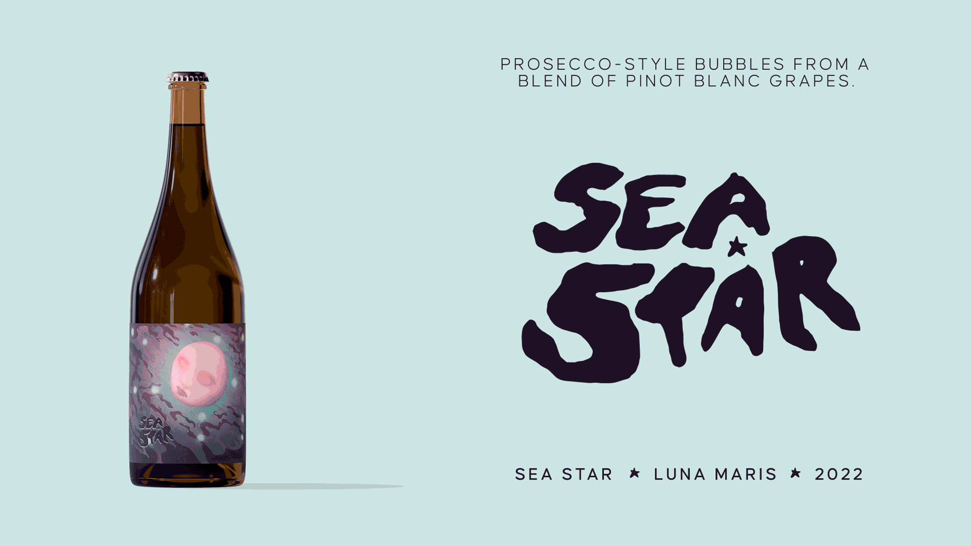
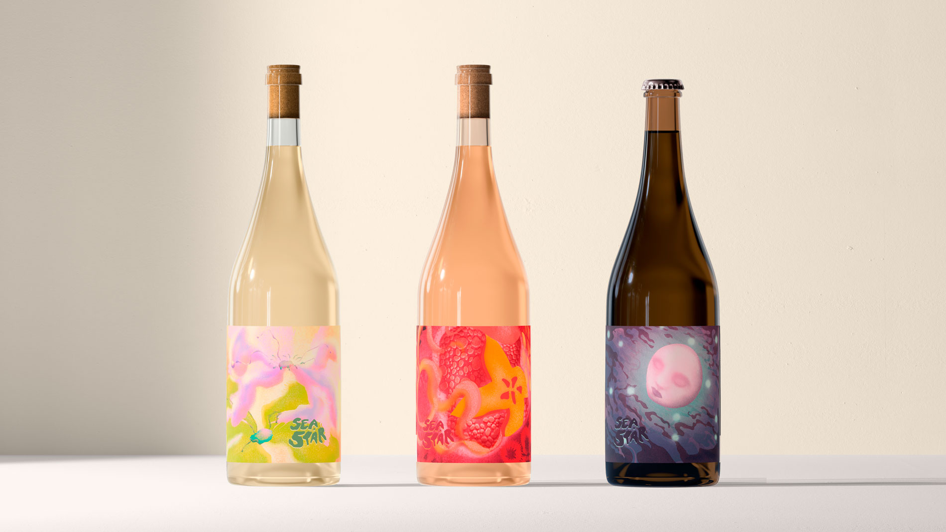
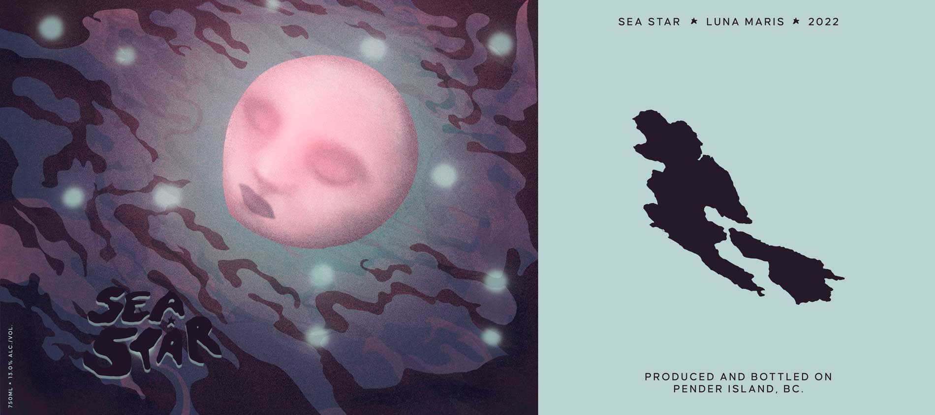
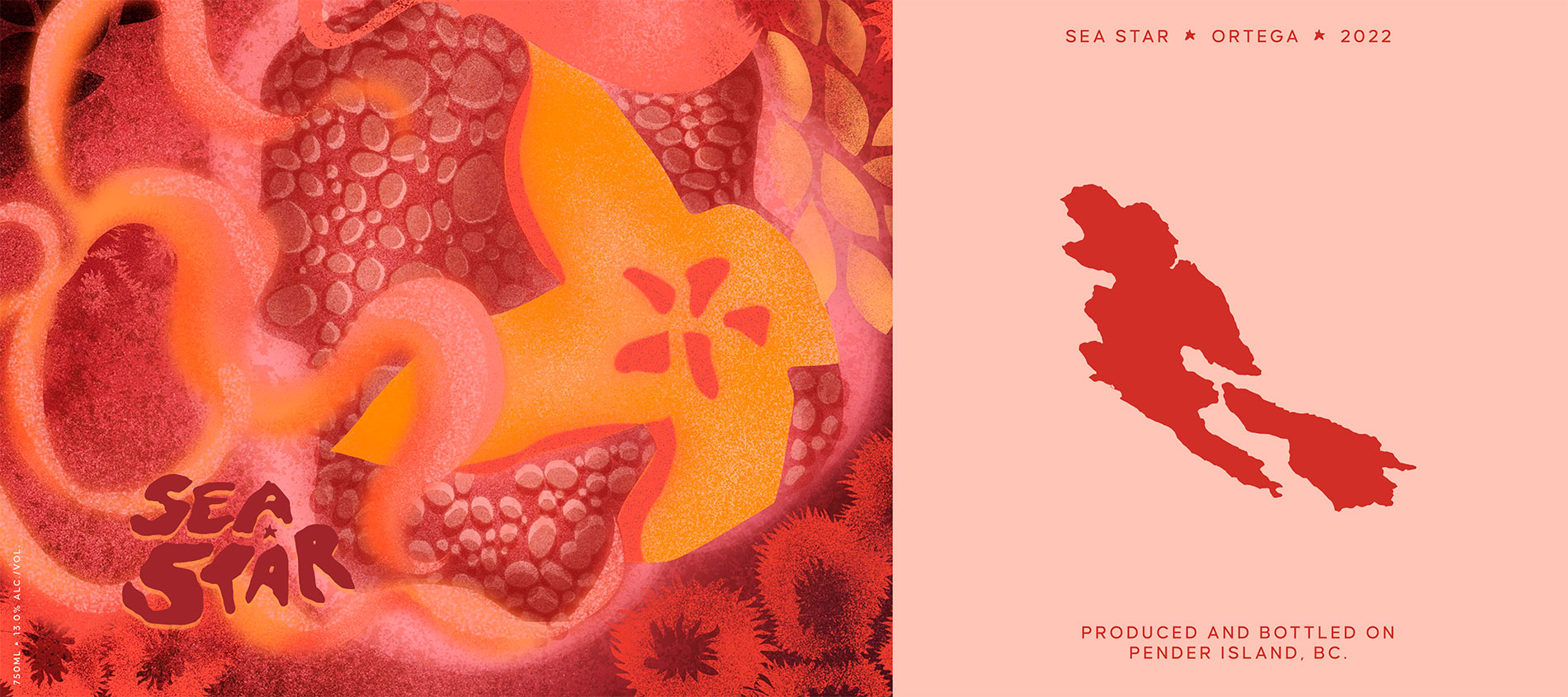
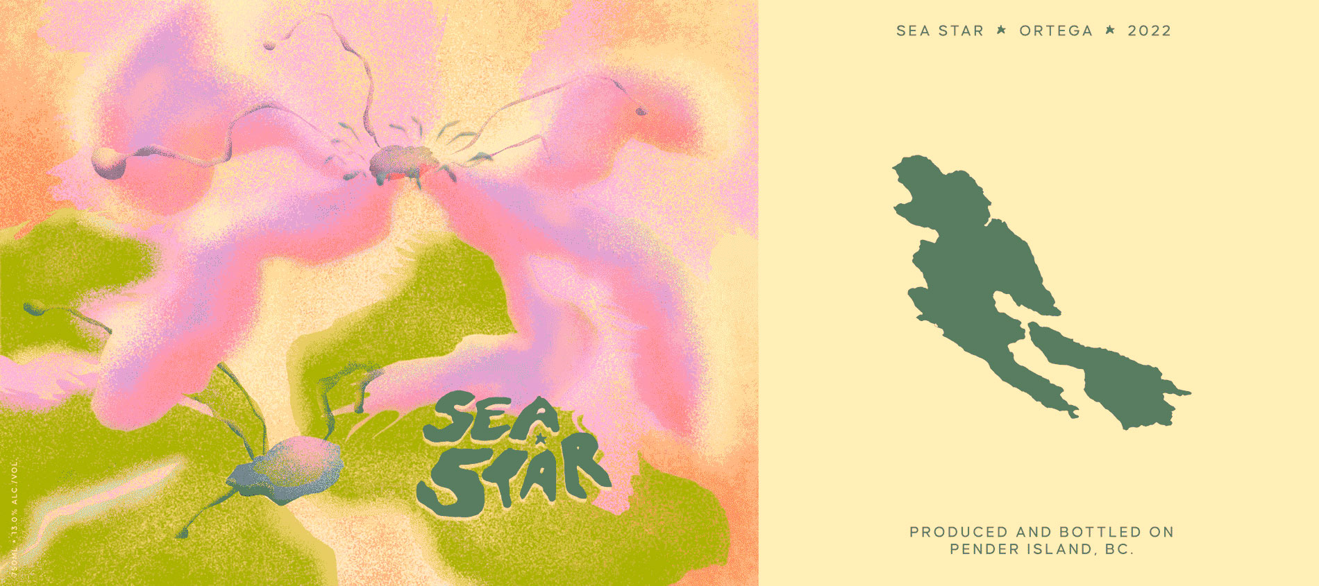
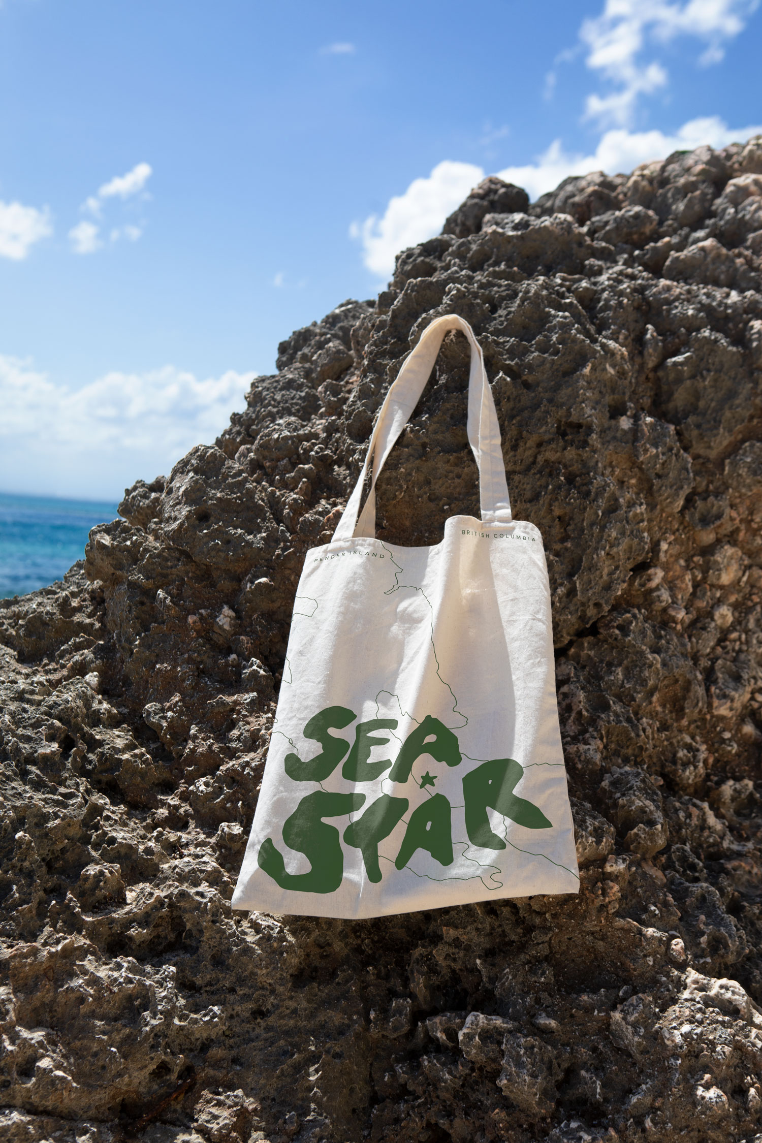
Inspired by the island's coastline, the updated logo is hand-drawn
to reflect the organic nature of the wine and terroir it emerges
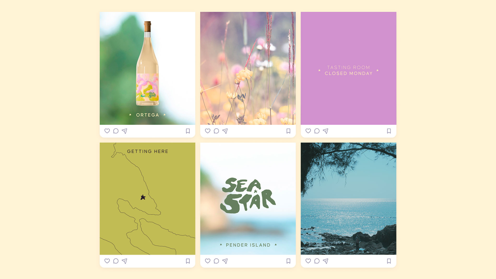
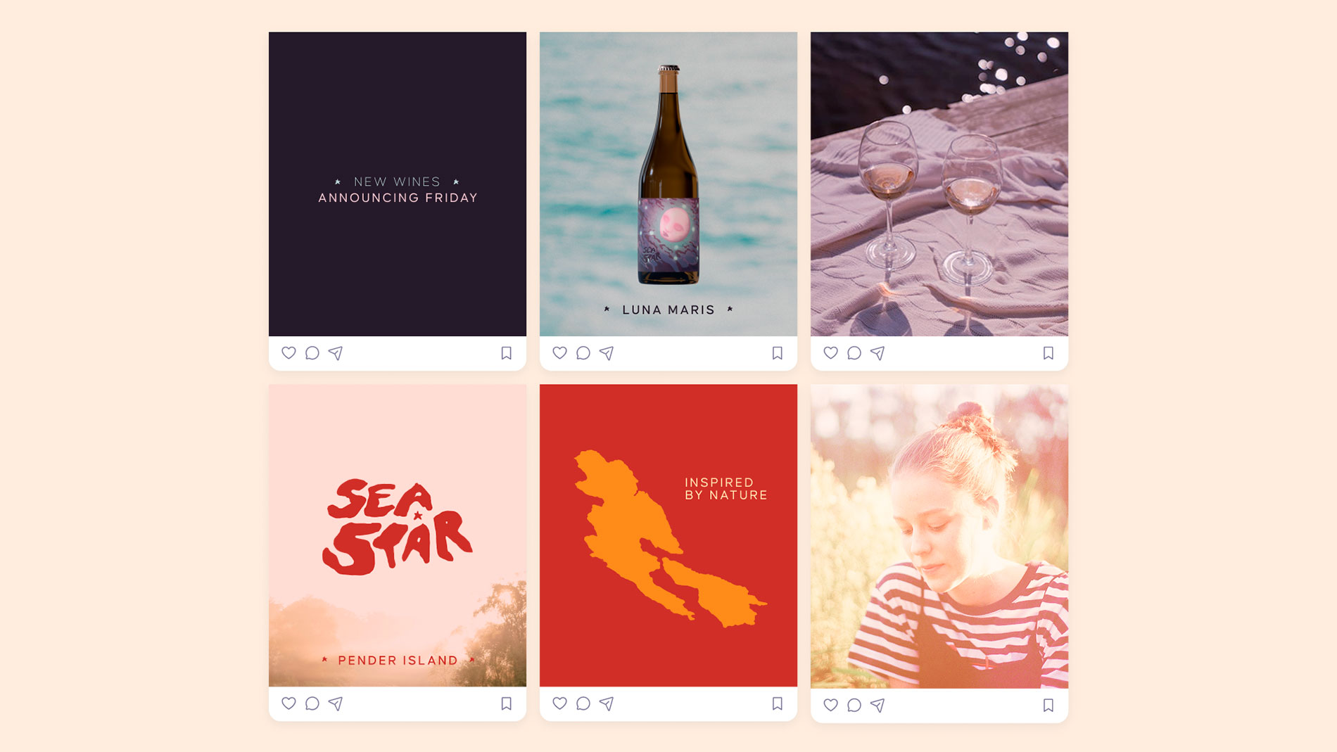
from. Socials posts are minimal in design to evoke the calming
sensation of being beachside, while leaning on simplistic sans
serif type and photography to enhance the classic, timeless, and
calming vibe of Pender Island. The eco-conscious audience who will
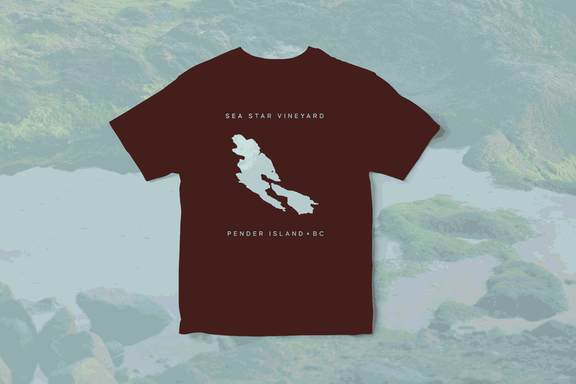
be inspired to buy this wine can further rep their loyalty with a
variety of t-shirt designs, and of course, a tote bag.