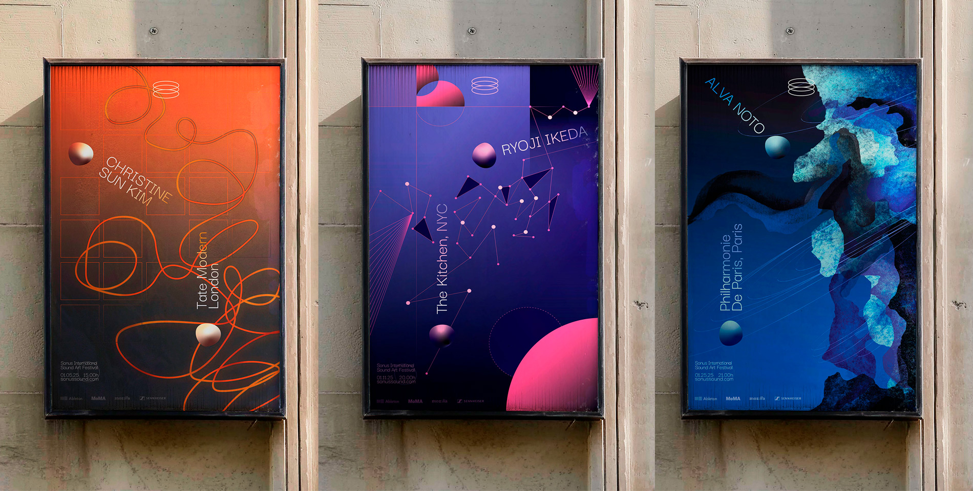
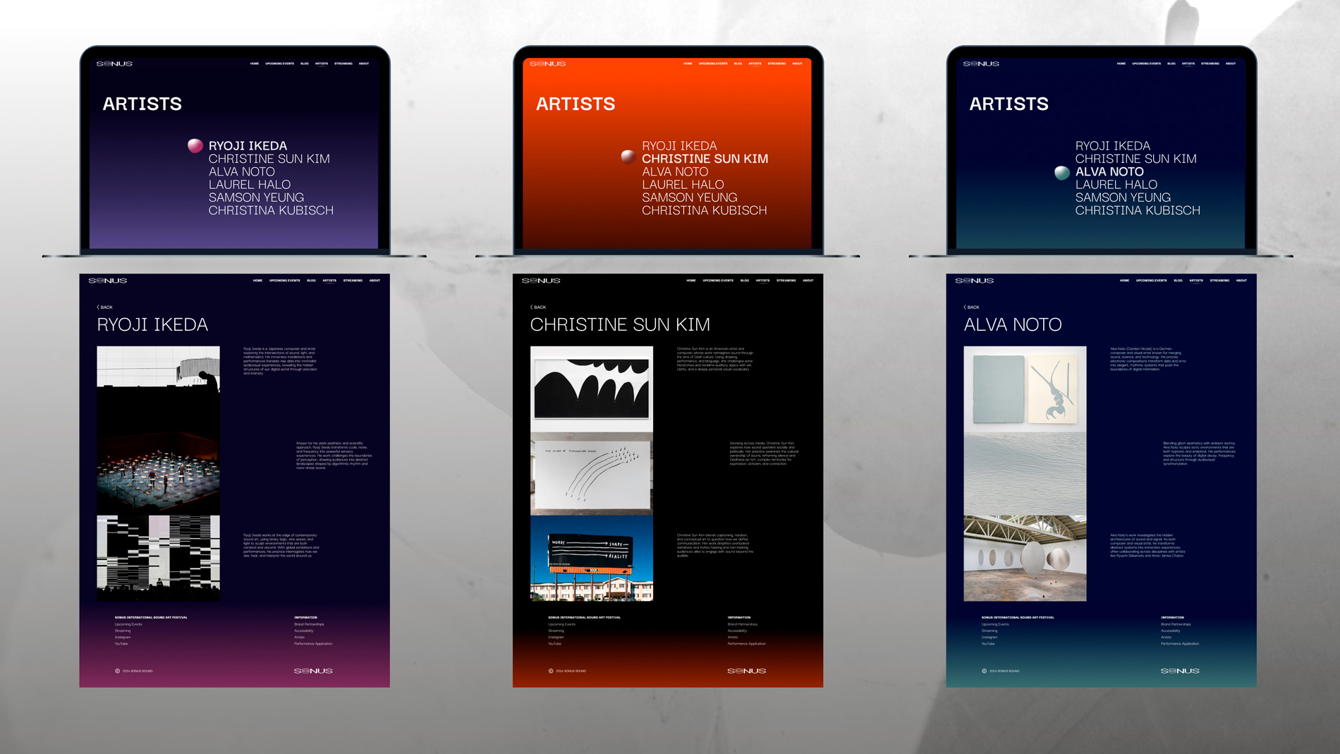
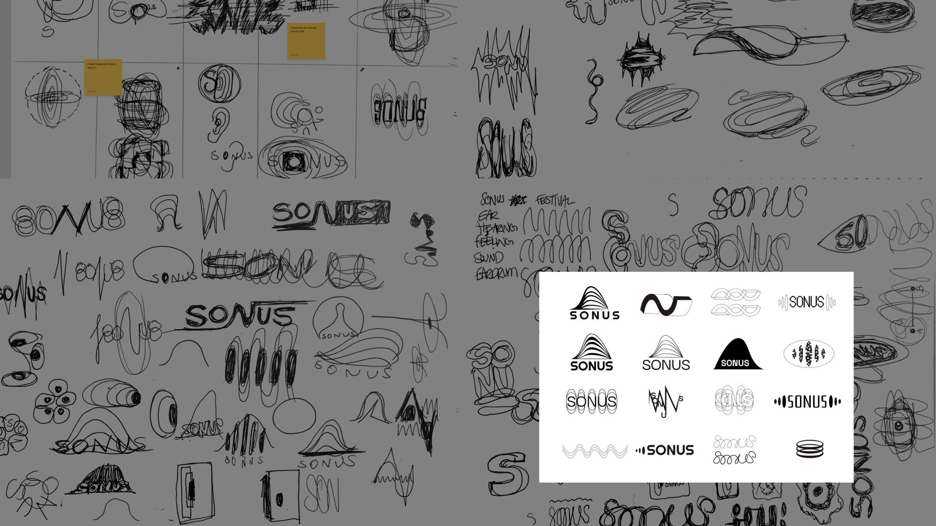
The Sonus Logo acts as the “O” within the word mark. The bitmap
aesthetic is a nod to the role of technology in sound art. The
standalone symbol alludes to sound waves and echoes: Sound bends,
stretches, flows, and fills space which is translated visually
into the “orb.” This brings a 3D quality to the graphic elements
of the brand. Without it’s depth and shading, the orb shows up as
a simple amorphous shape, alluding to the reality that sound can
feel expansive and it can also fall flat.